Choosing Kitchen Cabinet Colors: 2026 Palette Guide for Vancouver Island Homes
The color of your kitchen cabinets is the single most visible decision in the room. It also has to hold up better than almost anything else in your house, because you cannot easily change it. New counters can be retrofit. Backsplashes are replaceable. Hardware comes off in an afternoon. Cabinets are a fifteen-year commitment, minimum.
This guide walks through where kitchen cabinet color is heading in 2026, how Vancouver Island light affects what each color actually looks like, and how to test a finish before you sign off on it. We will also tour the colors we are seeing land most often in Victoria, Sidney, and across the Saanich Peninsula.
What Is Actually Trending in 2026
The biggest shift in kitchen cabinet color over the last few years is the move away from cool, sterile grays toward warmer, more saturated tones. The all-white, gray-island look that defined 2015 to 2020 still appears in new builds but has given up market share to two directions:
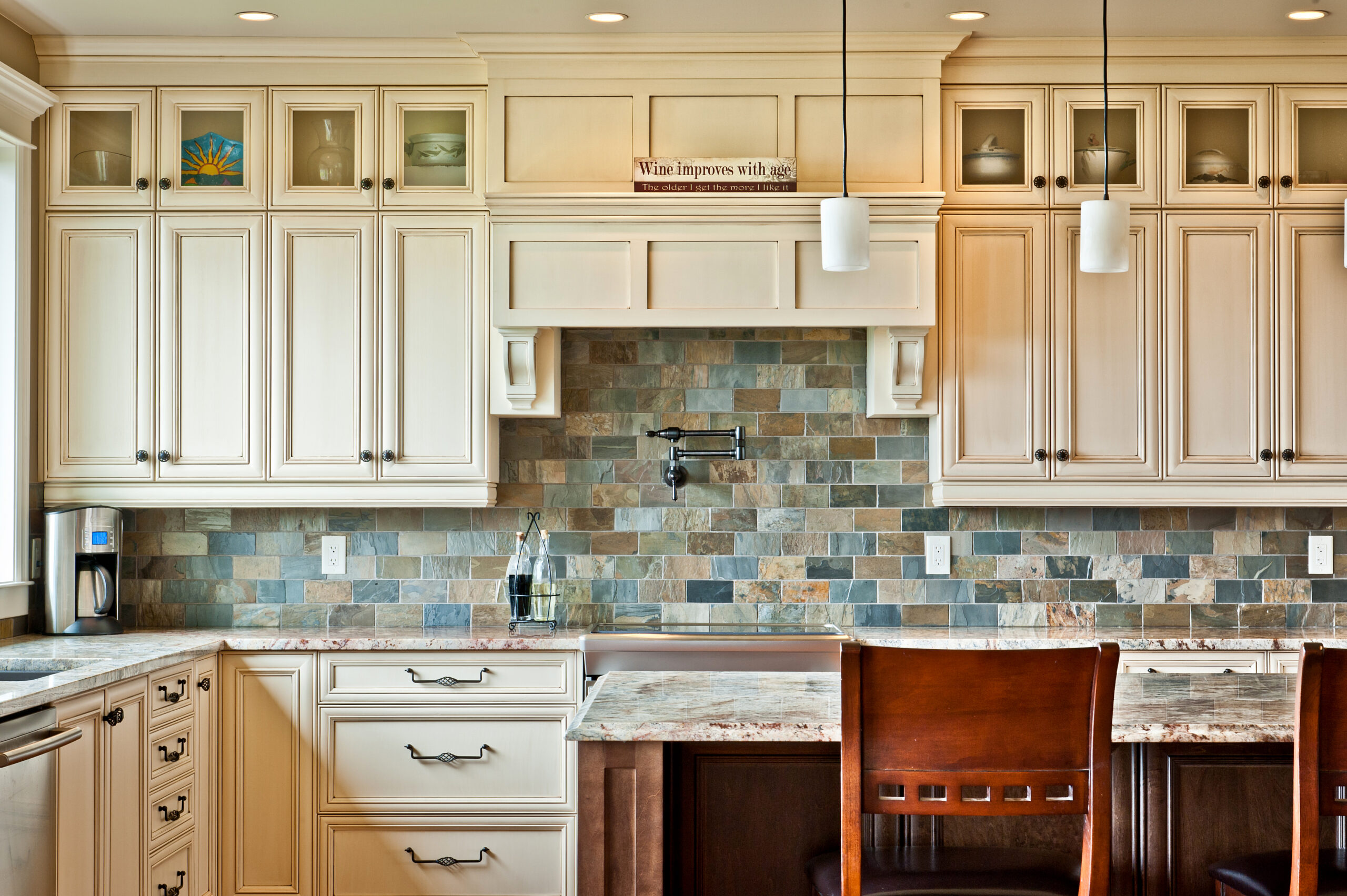
Warm neutrals. Creams, putties, warm whites, soft browns, and mushroom tones that read as inviting rather than clinical.
Deeper saturated colors. Forest greens, navy blues, deep olives, and warm grays with brown undertones. These show up most often on islands or lower cabinets paired with a lighter upper.
What is leaving the conversation, or at least getting quieter:
- Cool gray paint (Repose Gray, Mindful Gray, and similar)
- Stark white with cool undertones
- Yellow-orange honey oak stain (the kind that defined the late 1990s and early 2000s)
- High-gloss thermofoil
For broader 2026 kitchen design movements beyond color, see our 2026 kitchen design trends for Vancouver Island guide.
The Vancouver Island Light Factor
What a color looks like in a New York apartment, a Phoenix new build, or a Pinterest photo from a Seattle kitchen is not necessarily what it will look like in your home on the Saanich Peninsula.
Vancouver Island gets more than 200 days a year of overcast or partly cloudy sky. The light is softer, cooler, and has a marine quality that no amount of incandescent under-cabinet lighting fully replaces. That climate affects how every cabinet color reads:
Cool colors read colder. Gray-blue cabinets that look elegant in a sun-drenched California kitchen can feel hospital-clinical in a Sidney bungalow on a December afternoon.
Warm colors feel grounded. Warm whites, creams, and earthy greens hold their personality across cloudy and sunny days. They photograph well in either condition.
Wood tones soften everything. Natural wood (especially white oak and walnut) has built-in warmth that does not depend on sunlight to come through. This is part of why warm wood has stayed central in Vancouver Island kitchens even as other trends have rotated.
Test your color samples in the actual kitchen at the actual times you use it. Morning light, mid-afternoon, after sunset under your existing lighting. A color that looks perfect at 11 a.m. on a sunny April morning may disappoint you every weeknight in November.
The 2026 Color Directions Worth Considering
Five palette families are leading 2026 kitchen design on Vancouver Island.
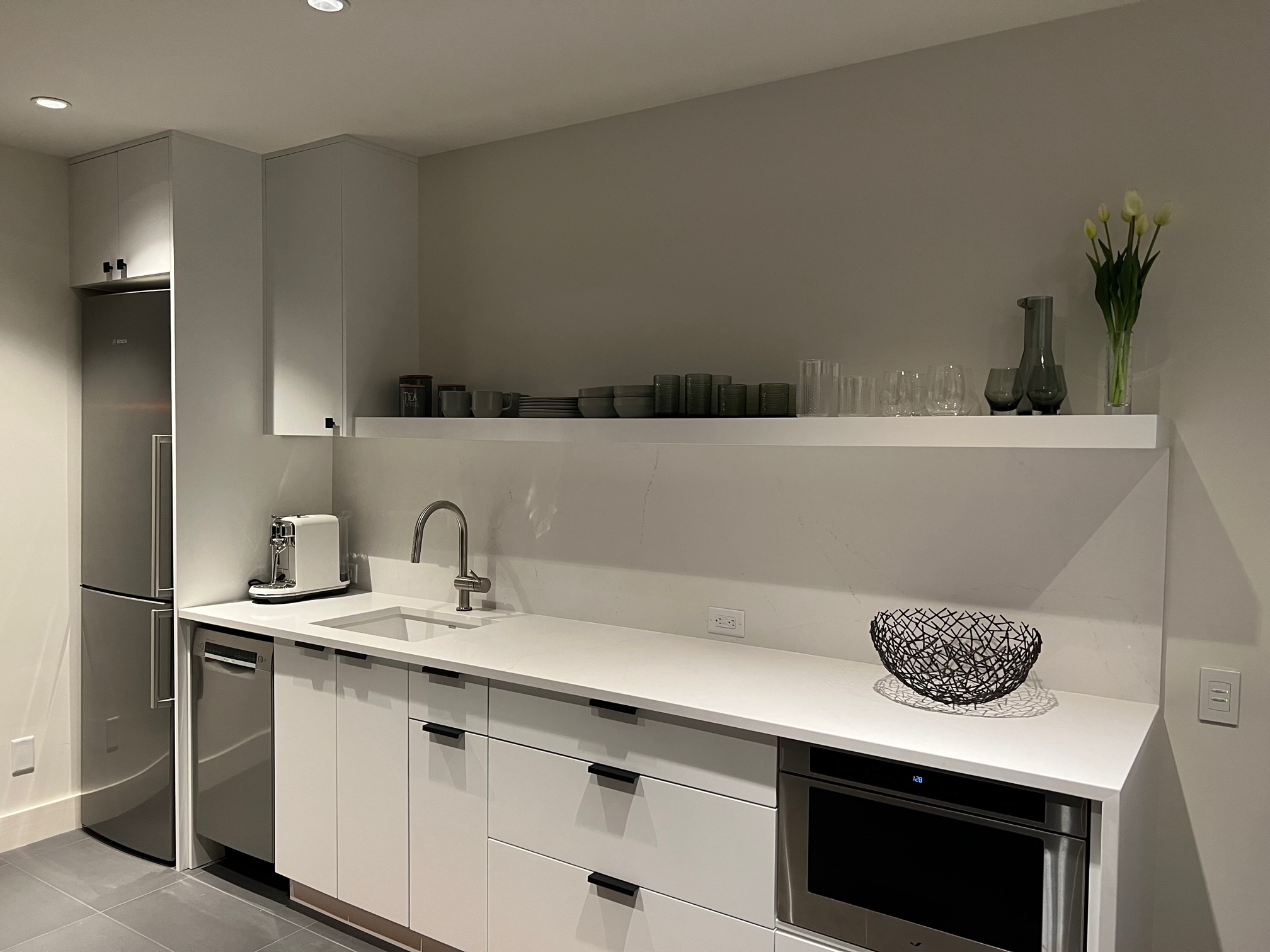
Warm whites and creams. The replacement for cool gray. These read as fresh and timeless without the chill. They pair with brass, satin nickel, or matte black hardware, and they let counters and backsplashes do most of the visual work. Best for: smaller kitchens that need to feel larger, north-facing kitchens that need warmth, and homeowners who want longevity over trend.
Earthy greens. Sage, forest, olive, and muted moss are the breakout colors of 2024 to 2026. Green is the natural complement to warm wood floors and white oak accents, both of which are also having a moment. Best for: kitchens with strong natural light, homes with a connection to nature, and Vancouver Island properties where the outdoor environment is part of the design conversation.
Deep blues. Navy, slate blue, and inky indigo on islands or lower cabinets, paired with a lighter upper or wall paint. Less risky than green for resale because blue has decades of staying power. Best for: kitchens that want a focal point without going as saturated as green or as dark as black.
Warm woods. White oak (rift-cut or quarter-sawn), walnut, and warm-stained maple. Wood is no longer the exception but a primary cabinet material in 2026, often used in flat-panel or shaker doors with visible grain. Best for: contemporary builds, mid-century renovations, and anyone who wants depth and character without a saturated paint color. Our birch versus maple cabinets guide covers the trade-offs between common wood species.
Soft warm neutrals. Mushroom, putty, greige, and warm taupe. These read as quiet sophistication. They support nearly any counter, backsplash, or floor choice. Best for: homeowners who want a stylistic upgrade from white without committing to a strong color, and for kitchens that will eventually be sold to buyers with their own design preferences.
Two-Tone Cabinets: The Dominant 2026 Approach
A single cabinet color across the entire kitchen is no longer the default. The dominant pattern in 2026 design is two-tone:
Light upper, dark lower. White or cream uppers with a saturated color (green, blue, walnut, dark gray) on the lower cabinets. Keeps the upper visual weight low and lets the bottom anchor the room.
Light perimeter, saturated island. Painted white or cream perimeter cabinets, with the island in a contrasting tone. The island becomes the visual statement piece without committing the whole room to a strong color.
Mixed materials. Painted perimeter, wood island. Or painted base, wood uppers. The combinations are nearly endless, but the principle is the same: avoid monotony, give the eye a focal point.
Reasons two-tone works in Vancouver Island homes specifically:
- Most older homes on the Island have generous kitchens with a clear island or peninsula, which gives two-tone a natural canvas
- The softer light handles color contrast better than harsh tropical or desert light, which can make two-tone schemes feel jarring
- Two-tone is more forgiving of taste evolution: if your saturated island color falls out of fashion, repainting one piece is much easier than repainting an entire kitchen
Color and Finish: How They Interact
The same color in a different finish reads completely differently. Three finish considerations matter:
Sheen level. Matte finishes hide imperfections, mute color depth, and feel modern. Satin (the most common cabinet finish) balances durability and softness. Semi-gloss reflects light, makes colors look more saturated, and is easier to wipe clean. High-gloss is rare in 2026 except for very modern designs.
Paint versus stain versus natural. Painted finishes give you the broadest color range and the cleanest look. Stains let wood grain show through and require selecting a wood species first. Natural (just sealed) is having a strong moment in 2026, especially with white oak.
Topcoat system. A high-quality conversion varnish or two-part polyurethane finish keeps cabinets looking new for fifteen years or more. A standard lacquer fades, yellows, and shows wear within five. Always ask your cabinet maker what finish system they use. See our cabinet finishes guide for the full breakdown.
How to Test a Color Before You Commit
Color choice mistakes are the most common and most expensive regret in kitchen design. A few practical ways to avoid them:
Get full-size cabinet door samples, not paint chips. A two-by-three-inch swatch on a fan deck will lie to you about how a color reads on a real door, in your real lighting, against your real counter. Most reputable cabinet makers (including us) will provide door samples in your shortlist colors.
Hold the sample against your counter and backsplash choices, not against the wall. The color does not exist in isolation. It exists next to quartz, tile, and flooring.
View the sample in three lighting conditions at minimum. Morning, mid-afternoon, and after dark under the lighting you actually plan to use.
Live with the samples for at least a week. A color you love on day one may grate on you by day five. Better to find out before the cabinets are built.
Photograph the samples. A camera sees color slightly differently than the eye, and photographs are how most of your friends, family, and future buyers will first experience the kitchen.
Avoid choosing color in a showroom alone. Showrooms have controlled lighting designed to flatter every color. Your home does not. Always cross-check at home before signing off.
Our 2026 Color Collection
A few of the cabinet colors we are seeing requested most often this year, and where each one tends to land best:
Sheer Beauty. A warm white with subtle character. Reads as crisp without going clinical. Works in nearly any kitchen, from heritage Oak Bay homes to contemporary Langford builds. See Sheer Beauty in our collection.
First Class. A classic, balanced neutral that handles both warm and cool design languages. Strong choice for homeowners who want flexibility for future decor changes. See First Class.
Flux. A deeper, more contemporary tone for homeowners drawn to saturated colors without committing to a strong green or blue. See Flux.
Free Spirit. A confident, expressive option for kitchens that want personality. Best in homes where the kitchen is a true social space and design statement. See Free Spirit.
Casting at First Light. A nuanced color that shifts subtly with the light. Particularly well-suited to Vancouver Island’s variable conditions. See Casting at First Light.
Mistakes to Avoid
A few color choice patterns that consistently lead to regret:
Following a trend that does not match your home. A heritage 1920s home in James Bay with deep moody navy cabinets can look stunning or wildly out of place, depending on the rest of the home. Color should respond to the architecture, not fight it.
Choosing the same color you saw on Instagram. Instagram photos are color-graded, filtered, and shot in specific lighting. The color in the photo is almost never the color in real life.
Picking a color before you know your counter and backsplash. Cabinets are usually chosen first, but their color choice should anticipate what they will pair with. Decide on the broad palette direction (warm versus cool) before locking in cabinet color.
Going too dark in a small kitchen with limited natural light. Dark cabinets can work beautifully in galley kitchens or small spaces, but they require careful lighting design. Without it, the kitchen feels closed in.
Matching cabinet color exactly to a wall paint. The wall paint can be repainted in an afternoon. The cabinets cannot. Choose the cabinet color first, then bring the wall color into harmony with it.
Frequently Asked Questions
What is the most popular kitchen cabinet color in 2026?
Warm whites and earthy greens are leading the requested-color lists for 2026 on Vancouver Island. Two-tone designs (light perimeter, saturated island) account for a meaningful share of new projects.
Will my kitchen look dated in five years if I pick a trendy color?
Possibly, depending on the color. Warm whites, creams, and natural wood tones are unlikely to date quickly. Bold saturated colors (deep greens, navy blues) have a longer track record than ultra-trendy colors of past decades, but no color is fully recession-proof. The safest hedge is to put the saturated color on an island or lower cabinets where it can be repainted later without redoing the whole kitchen.
Is white still a good cabinet color choice?
Yes, with a caveat. Cool whites are becoming rare. Warm whites, creams, and off-whites are still strong choices and are unlikely to look dated. They are also the most forgiving for future buyers if you sell the home.
Can I paint over cabinets in a different color later?
Yes, but professionally repainting kitchen cabinets costs $3,000 to $8,000 depending on size and finish system. Better to choose carefully the first time than plan for a repaint.
How do I pick a color that matches my home’s exterior?
You do not need to match exactly. The principle is harmony, not matching. A home with warm cedar shingles and brown trim works best with warm interior cabinet colors (creams, putties, warm wood, warm greens). A home with cool gray siding and white trim works best with cooler cabinet colors.
Should the island be a different color from the rest of the cabinets?
Often yes. It is the dominant 2026 design pattern. A contrasting island provides a focal point and breaks up large kitchens visually. The exception is small kitchens where a single cohesive color helps the space feel larger.
Where can I see kitchen cabinet colors in person on Vancouver Island?
Visit our showroom or book a consultation to see door samples in real light and pair them with counter and backsplash options.
Ready to Choose Your Kitchen Cabinet Color?
Color choice is where a kitchen renovation either starts looking like the homeowner’s actual taste or becomes a hostage to whatever was trending three years ago. Take it seriously. Sample widely. Test in your real space. And pick the color that you will still love at the end of a rainy Vancouver Island February, not just under a flattering showroom light.
Harbour City Kitchens designs and builds custom kitchens for homes across Vancouver Island, with projects in Victoria, Sidney, Saanichton, Langford, and Nanaimo. Our in-house design team can walk you through color choices for your space, your light, and your home’s character. Book a consultation to get started.